-
Roadmap & Feedback (major)
- Introduced a single unified
RoadmapBoardcomponent used on both user and admin views, controlled by a simpleeditablecapability flag. - User-facing page
/roadmap: read-only board with columns (New / In progress / On hold / Resolved), compact and list views, scrollable columns, and a modal “Submit feedback” button. - Admin mode on
/roadmap: ifprofile.role === 'superadmin', a header button toggles admin mode via?admin=1, enabling drag-and-drop, per-card menu (Move/In progress/On hold/Resolved/Delete), and a detail modal with status actions. - Removed redundant admin page;
/admin/roadmapnow redirects to/roadmap.
- Introduced a single unified
-
Feedback infrastructure
- Database: added
public.feedbacktable (kind, email, message, image_url, status, timestamps),profile.roleenum (user|admin|superadmin), andfeedback.statusenum (new|in_progress|resolved). - Later additions:
statusincludeson_hold, and feedback hastitle,author_name,author_email,author_avatarfor richer records. - API:
POST /api/feedback(create + notify),PATCH /api/feedback/[id](status updates),DELETE /api/feedback/[id](remove), plus form POST fallback. - Uploads: single image up to 5MB stored in Supabase
filesbucket; public preview supported. - Notifications: sends to
SUPPORT_EMAIL(falls back toRESEND_EMAIL).
- Database: added
-
UI & navigation
- New reusable
PageHeader(logo → projects, title, descriptor, right-side actions, theme/menu) used on/projects,/roadmap, and admin. - Menu avatar “Feedback” link now points to
/roadmap. - Consistent width and spacing with the top bar; columns use
max-h+ internal scroll.
- New reusable
-
Docs
- Expanded
docs/ui-and-component-guide.mdwith the newPageHeaderusage and the roadmap/feedback flow.
- Expanded
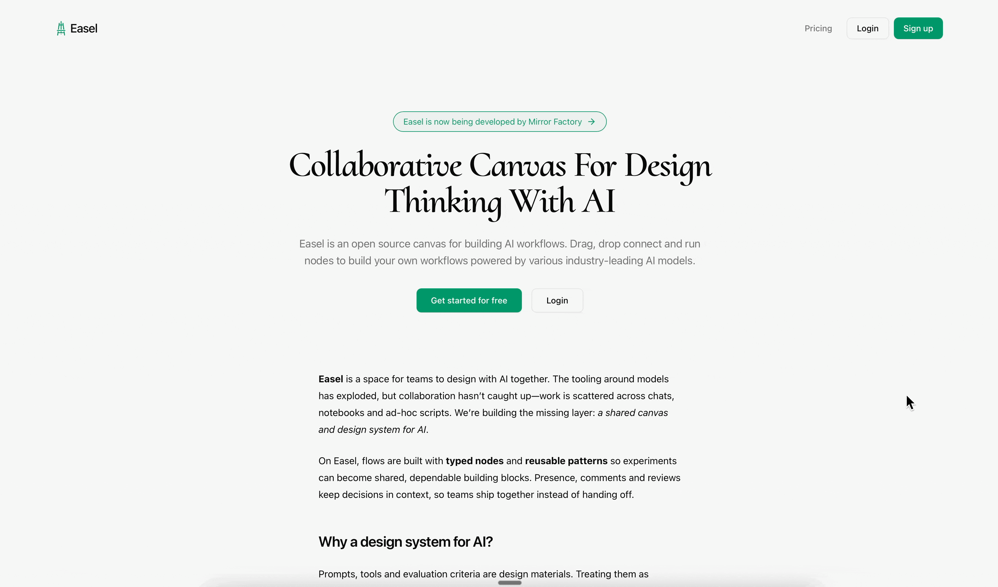
 Easel
EaselChange Log
Releases, improvements, and behind-the-scenes changes.
-
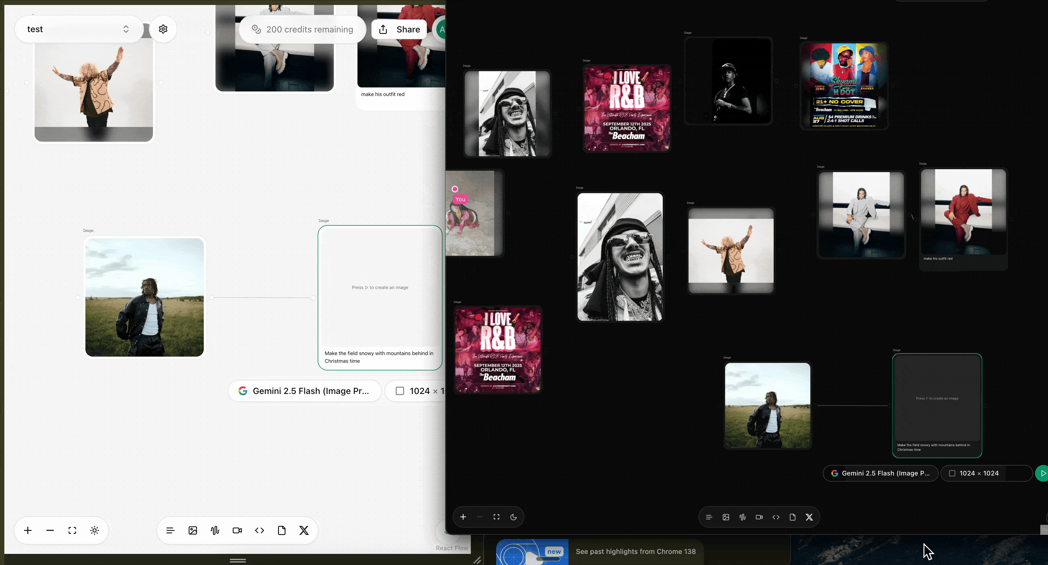
Unified Batch Processing UI (major)
- Introduced a reusable
GeneratorBarcomponent with a model selector, prompt input, and "Generate to Batch" button to standardize question generation. - Created a shared
QueryListcomponent featuring a hover-to-edit list, per-query status indicators (idle, running, done, error), and sticky "Add" / "Run Batch" controls. - Refactored the AI Compare, Perplexity Search, and Google Search Results nodes to use these new components, creating a consistent, predictable batch workflow across the application.
- Added per-row "Rerun" buttons to all batch query lists for quickly re-executing a single query.
- Introduced a reusable
-
AI Compare Node
- Single mode UI now features collapsible toggles for each provider's text response and a consolidated list of source links.
- An inline settings panel (gear icon) was added to allow model selection for each provider (OpenAI, Gemini, Claude).
- Hardened state management to ensure running a single query does not clear batch results, and vice-versa.
- Updated default models to
gpt-4.1-mini,gemini-2.5-flash-lite, andclaude-3-5-haiku-20241022.
-
Perplexity & Google Search Nodes
- The "Single" and "Batch" mode toggles have been moved into the node's main toolbar, creating a consistent entry point for all three search-oriented nodes.
- The SerpApi node was renamed to "Google Search Results," and its header controls were streamlined into a single, efficient row.
- State management was hardened in both nodes to isolate single and batch results.
-
Liveblocks & Canvas UX
- Refined the Liveblocks presence indicator with multiple padding and sizing adjustments to fix background clipping and create a polished, visually balanced name tag.
- Added a custom SVG cursor for other users to improve collaborative awareness, while removing it for the active user to reduce clutter.
-
Backend & API
- Patched the OpenAI, Gemini, and Anthropic search routes (
/api/*/search) to align with recent breaking changes in provider APIs, resolving critical 400 and 500 errors.
- Patched the OpenAI, Gemini, and Anthropic search routes (
- AI Compare Page
- Added a Perplexity‑style citations list with favicons and a coverage table (ChatGPT, Gemini, Claude, SerpApi) that shows per‑URL checkmarks and totals.
- Normalized URL extraction across providers (OpenAI web_search_preview, Gemini Search, Claude Web Search, SerpApi Organic/AI Overview) to populate citations consistently.
- Redirect Resolution (Server)
- Implemented
/api/resolveto follow known redirectors (e.g.,vertexaisearch.cloud.google.com/grounding-api-redirect) server‑side and return the final URL, avoiding cross‑origin redirect/CORS issues in the browser. - AI compare page now resolves Vertex redirect links before rendering favicons/domains and the coverage table, eliminating
faviconvertexaisearch.cloud.google.comnoise.
- Implemented
- Docs
- Updated changelog according to project policy; captured user‑visible impact and backend utility addition.
-
Perplexity (major)
- Added a new "Perplexity model" mode that calls the
chat/completionsendpoint with a system prompt for longer, well‑structured Markdown answers. Answers render at top with compact source pills (favicon + hostname), capped to 6. - Batch mode now stores and renders per‑query
{ answer, citations }entries (right pane mirrors Single mode). Question text is shown above each answer in both Single and Batch views. - Normalized model IDs to supported
sonar/sonar-pro(dropped legacy*-online). UI accepts gateway ids likeperplexity/sonar-proand maps them correctly. - Backend route
/api/perplexity/searchupdated: supportsmode=search | chat | generate_questions, accepts optionalsystemstring for chat, sanitizes search payload, normalizes model ids, and flattens citations from multiple shapes. - UI hardening: invalid/missing source URLs handled gracefully; fixed
ReactMarkdownimport and children handling. - Sizing: default height reduced to
680(was800) for a tighter node; fullscreen enabled; output‑only connectors enforced.
- Added a new "Perplexity model" mode that calls the
-
Audio node (consolidation + UX)
- Voice Memo node removed; Audio now includes recording as a first‑class option.
- Two‑column 50/50 layout with consistent green iconography; transcript area is fully scrollable and copyable.
- Immediate client‑side validation for file type/size (MP3/WAV/WEBM/M4A/MP4/OGG, ≤10MB); invalid uploads are blocked with messaging.
- Dual‑mode support wired into NodeLayout (Plain/Generate), matching Text/Image/Code patterns.
-
Web Renderer (HTML/URL)
- Secure iframe (
sandbox="allow-scripts allow-same-origin"). - URL vs Code toggle with "Load Source" via
/api/proxy; connecting a Code node clears URL and vice‑versa. - Device viewport toggles (Mobile/Tablet/Desktop) and collapsible HTML editor with capped height.
- Fixed missing
useStateimport and layout expansion of the bottom editor.
- Secure iframe (
-
Tiptap stability
- Liveblocks extension registration moved into a guarded
useEffectafter editor/provider are ready; UI elements (Toolbar, BubbleMenu, Threads/Composer) are guarded to avoid render‑phase updates. Resolves "Cannot update a component while rendering a different component" and undefinedstateerrors.
- Liveblocks extension registration moved into a guarded
-
Canvas, toolbar, and palette
- "Add node" palette opens centered, autofocuses search, scales relative to zoom, hides connectors, and avoids the double‑frame effect.
- New node spawning aligns horizontally with the farthest‑right node, uses width‑aware spacing, and recenters the camera with a slight zoom‑out.
- Added a testing action to add one of every node type in a spaced grid.
- Save indicator moved into the top bar (to the left of the avatar); canvas controls moved to the bottom‑left above the "+" button.
-
NodeLayout window chrome (refinements)
- Fullscreen button lives in the left cluster and only shows when supported.
- Added separate Position‑lock and Content‑lock buttons (content lock no longer affects dragging). Active state uses green icon on white background; tooltips added for all controls.
- Delete action now shows a confirmation modal; bar uses the darker emerald accent and proper spacing to avoid content overlap.
-
Text/Image/Video/Code
- Text: transform view resized; prompt and output areas use
min-h-0 overflow-autowithnowheel nodrag nopanto prevent canvas pan. Added compact Sources panel and copy button; plain view matches size and includes copy. - Image/Video/Code: larger defaults; dual‑mode toggles enabled; prompt inputs capped with internal scroll. Video’s model selector moved to the bottom toolbar.
- Text: transform view resized; prompt and output areas use
-
Docs
docs/ui-and-component-guide.mdexpanded with: dual‑mode pattern (includingtitleOverrideanddualModeSupported), per‑node min/max sizing guidance, consistent sizing contract (palette vs component), scrolling/overscroll best practices, fullscreen/window‑chrome flags, and custom connectors (allowIncoming/allowOutgoing).docs/xyflow-data-consumption.mdupdated to include Perplexity as a producer and new extractors.
-
Utilities & APIs
- New
/api/proxyendpoint for CORS‑safe HTML fetching used by Web Renderer. lib/xyflow.tsgainedgetTextFromPerplexityNodesandgetLinksFromPerplexityNodes; Text Transform consumes both for better context.
- New
-
Architectural Layout Fixes
- Overhauled the core
NodeLayoutcomponent to fix deep-seated CSS bugs that caused connector misalignment and inconsistent node sizing. This architectural change ensures all nodes are visually and logically consistent. - Established and documented two official layout patterns in
ui-and-component-guide.md: "Fill Frame" for fixed-size nodes and "Hug Content" for dynamically-sized nodes, eliminating guesswork for future development. - The sizing contract is now enforced: a node's creation properties in
lib/node-buttons.tsmust match the internal component defaults to prevent layout discrepancies.
- Overhauled the core
-
Node UI & UX Enhancements
- Text Node: The UI for both the primitive and transform modes of the Text node has been completely rewritten. They now share a consistent, larger frame size (
560x420) and correctly implement our new layout patterns. - The transform
Textnode now features a scrollable content area and a fixed prompt window, preventing the UI from breaking with long text generations. - A Copy button has been added to the primitive
Textnode for feature parity with the transform mode. - Editor (Tiptap) Node: Fixed a critical bug where the node's connectors were misaligned due to a conflict between the node's internal width and its creation width.
- Text Node: The UI for both the primitive and transform modes of the Text node has been completely rewritten. They now share a consistent, larger frame size (
-
New Web Renderer Node
- Added a new Web Renderer Node that can render HTML from a connected
Codenode or a URL, built on the new robust "Fill Frame" layout pattern.
- Added a new Web Renderer Node that can render HTML from a connected
-
Perplexity Node Updates
- Palette defaults:
width: 1200,height: 800,resizable: true,fullscreenSupported: true,fullscreenOnly: false. - Data flow: seeds Batch queries automatically from connected Text/Tiptap/Firecrawl incomers via
lib/xyflowhelpers when its list is empty. - Batch UI: left pane edit/done toggle; per-query status indicators (running/done/error); progressive runner updates statuses live; right pane renders results for the selected query.
- Single UI: 2‑column results; "Search with Perplexity" button in accent color with icon.
- Generate UI: editable list of generated questions; "Send to Batch" only (accent). Removed "Send & Run" to simplify flow.
- Palette defaults:
-
Fullscreen Support (NodeLayout)
- New flags in node data:
fullscreenSupported: enables fullscreen control and context‑menu item.fullscreenOnly: gates content until entering fullscreen.
- Fullscreen overlay renders in a portal to
document.bodywith a green frame; exit via circular green button (white X). Inline node controls/toolbar are hidden while fullscreen is active.
- New flags in node data:
-
Sizing & Scrolling Rules
- Keep creation defaults (
lib/node-buttons.ts) and component fallbacks identical. - Fill Frame nodes: pass
width/heighttoNodeLayout; direct child usesflex h-full flex-col. - Hug Content nodes: omit
height; direct child usesflex flex-colonly (noflex-1/h-full). - Scroll containers:
min-h-0 overflow-auto+nowheel nodrag nopanandonPointerDown(e.stopPropagation())to prevent canvas pan. - Canvas: use
touch-none/overscroll-containand non‑passivectrl+wheel/gesture*handlers to avoid page zoom.
- Keep creation defaults (
-
Toolbar / Registry
- Palette entries live in
lib/node-buttons.ts; node components are registered incomponents/nodes/index.tsx. - Toolbar now scrolls (up to 70vh) so all nodes remain accessible.
- Toolbar actions: add node at viewport center; palette icons reflect node types; window bar introduced for nodes with (delete, duplicate, show data, position lock, content lock, fullscreen when enabled).
- Palette entries live in
-
Documentation
- UI guide expanded with: Fill Frame vs Hug Content, NodeLayout contract, scrolling/pan prevention, toolbar/registry workflow and checklist, and the new window‑chrome/fullscreen flags with examples and troubleshooting.
-
Context & Data Flow (New patterns)
- Added a dedicated "Node Data I/O" section in
ui-and-component-guide.mddescribing Producer/Consumer patterns, per‑nodedataownership, and shared extractors inlib/xyflow.ts. - Perplexity node now writes flattened outputs for downstream nodes:
outputTexts:["<title> — <snippet>", …]outputLinks:['https://…', …]
- New extractors in
lib/xyflow.ts:getTextFromPerplexityNodes,getLinksFromPerplexityNodes. - Text Transform consumes Perplexity outputs (texts + links) and renders a compact, scrollable "Sources" box.
- Added a dedicated "Node Data I/O" section in
-
Canvas UI & Controls
- Palette toolbar: tooltips added; updated icons (Web Renderer → Monitor, Fullscreen Demo → Maximize2, Perplexity → Search).
- Split panels: palette toggle returned to bottom‑left; canvas controls moved to bottom‑right, vertical, offset above save check.
- Fine‑tuned controls offset to avoid overlap across viewports.
-
Add Node (Drop) Menu Improvements
- Larger command palette (scales inversely with canvas zoom), autofocus on open, correct z‑index, scrollable results, and a single visible surface (no double frame).
- Connectors hidden while the drop menu is open; window bar suppressed for a cleaner picker.
-
Node Chrome & UX Fixes
- Focus action in context menu now centers the camera using
fitViewwith padding; added separate "Show data" item. - Data dialog constrained with
max-w/max-hand internal scrolling for large JSON.
- Focus action in context menu now centers the camera using
-
Fullscreen Enablement
- Web Renderer and Perplexity primitives now set
fullscreenSupported: true(andfullscreenOnly: false) so the inline control and context menu appear. Removed the demo fullscreen node.
- Web Renderer and Perplexity primitives now set
-
Connector Options (Per‑node)
NodeLayoutnow respects optionaldata.allowIncominganddata.allowOutgoingflags to show/hide left/right handles.- Perplexity configured as output‑only (
allowIncoming: false,allowOutgoing: true). Documented in the UI guide under "Custom connectors and UI interactions."
-
New Nodes for Data Ingestion
- Added a new Firecrawl Node to allow scraping and crawling websites directly on the canvas.
- Introduced a Perplexity Search Node to perform web searches and bring live data into your workflows.
-
Canvas & UI Overhaul
- The main canvas can now be locked, preventing any panning or zooming for a more stable editing experience.
- The top UI bar can now be hidden by clicking the Easel logo in the top-left, providing a distraction-free "Zen Mode."
- The bottom node-creation menu has been streamlined into a single "+" button, which now opens the command palette for a cleaner interface.
-
Node UI & Interaction
- Refactored the Text Node to use a content-driven height and a fixed header, ensuring the generation prompt is always visible while long text scrolls correctly.
- Established a new, consistent UI pattern for nodes with flexible content areas (
flex-1) and fixed instruction areas (shrink-0). - Tightened the line height and paragraph spacing in text nodes for a more compact and polished look.
- The primitive Text Node is now always editable, allowing users to type without first selecting the node.
-
Enhanced Node Locking
- Restored and improved the node locking functionality. The context menu now correctly displays "Unlocked," "Lock position only," and "Lock position & edits."
- Implemented robust drag prevention for locked nodes, ensuring they cannot be moved even during a multi-select operation.
- Added distinct visual feedback for different lock states, including color-coded borders and descriptive badges.
- New Tiptap Node
- We've added a brand-new node powered by Tiptap for collaborative, rich text editing right on the canvas.
- Enhanced Voice Memo Node
- The voice memo node has been upgraded and now includes an option for automatic transcription.
- Inspector UI Improvements
- The inspector panel has been updated with improved functionality, making it easier to manage and edit your nodes.
- Dependencies & Styling
- We've updated our dependencies and global styles to support these new features and ensure a consistent, polished experience.
- New Project Page
- After logging in, you will now land on a brand-new Project Page. This central hub lets you see all your projects in one place.
- You can now easily track who created each project, when it was made, and perform actions like renaming and deleting projects.
- Advanced Debug Mode for Stress Testing
- We've introduced a powerful new Debug Mode to help us test the platform's limits and ensure the live collaboration features are robust.
- This mode allows us to add a large number of nodes, connections, and trigger simultaneous generations to stress-test the system and identify performance bottlenecks.
- Canvas Interaction
- Disabled the default text highlighting behavior that would occur when adding a new node, resulting in a cleaner and more focused user experience.
- Removed the two-finger swipe gesture for back-and-forward page navigation to prevent accidental navigation while working on the canvas.
- Branding & UI Updates
- The project has been rebranded to Easel! We've simplified and customized the home page to reflect the new branding.
- Live Collaboration & Sharing
- The new Liveblocks and Zustand-powered collaboration system is live. We're currently stress-testing the platform to ensure a fluid, real-time experience.
- We've improved the share and invite link system with new roles:
- View-only: Users can interact with the canvas, but their changes will not be saved.
- Edit: Users have full collaborative power, and all changes are saved and synchronized in real time.
- Presence is fully enabled, so you can see user avatars and cursors.
- Changelog & Development
- We've added this new changelog to keep you updated on all our progress. It's connected directly to our GitHub repository to ensure transparency.
- We're currently debugging a few minor issues with the new collaboration features and will be enhancing the system further.
- Authentication & Permissions
- Implemented Supabase user authentication for all Liveblocks sessions, introducing robust access control based on user roles. Read-only tokens are now generated for guests, securing project data.
- Collaboration & Presence
- Rebuilt our Liveblocks integration to use a Zustand store for state management, mirroring best practices for cleaner, more maintainable code.
- Merged Liveblocks Storage and Presence into this new system. Users can now seamlessly join a room directly from the Canvas, with fully functional live cursors and a synchronized React Flow board.
- Optimized presence updates by throttling them to
~30ms, and now only commit final node positions on drop. We've also disabledselection-on-dragto significantly reduce re-renders during collaborative sessions.
- Canvas & Flow UX
- Edges are now correctly pruned when a node is removed. Users can also alt/ctrl-click to quickly delete edges.
- Introduced an experimental node locking mechanism in the Canvas for safer manipulation of elements during collaboration.
- Liveblocks + Yjs Integration
- Integrated Liveblocks for realtime collaboration, wiring up Yjs for shared state synchronization and live presence.
- Iteratively refactored the Canvas to use
Y.Mapstructures for state management, which was later replaced by a more robust Zustand implementation.
- Sharing & Environment
- Share links are now environment-aware and will always generate a production URL.
- Audio Pipeline
- Implemented a full audio recording and transcription feature in the Audio node, complete with a polished UI and clear user feedback during processing.
- Project Initialization
- Bootstrapped the official repository, cleaned up dependencies, and established the foundational infrastructure for the project.
- Supabase, Stripe, & Email
- Upgraded the Supabase configuration to support Postgres 17 and enabled the
send-emailEdge Function, powered by SendGrid, with JWT verification. - Integrated Stripe for billing (currently in test mode), including a webhook that gracefully handles the
checkout.session.completedevent and a system for credit tracking. - Replaced Twitter with Google as the primary social authentication provider.
- Upgraded the Supabase configuration to support Postgres 17 and enabled the
- Performance & Configuration
- Tuned the runtime by reducing the
maxDurationfor serverless functions from 13 minutes to 5, ensuring more responsive interactions.
- Tuned the runtime by reducing the
Tech highlights
- Core Frameworks: Next.js 15, TypeScript (strict), Shadcn/UI, React Flow
- Collaboration: Liveblocks (Presence, Storage) with a Zustand store for state management
- Backend: Supabase (Auth, Database, Edge Functions)
- Services: Stripe for billing and credit tracking (test mode), SendGrid for transactional emails, and Cloudflare for authentication.
- Tooling: pnpm, ESLint (airbnb-base), Zod schemas, Vercel deployment
Changelog policy
- We track features strictly from this fork, which is based on the original open-source Tersa repository by Hayden Bleasel. Older upstream release notes were archived and replaced on 2025-09-19. The Update Log page renders this file directly.
Get Started today
Get started for free and start creating your own AI workflows.